ALL WHITE PAINT LOOKS THE SAME AND OTHER LIES YOUR FRIENDS TELL YOU TO KEEP YOU SANE.
PART THREE.
To catch you up since the last post, we are now in April and our house is weather tight (thank goodness because April showers and all) – and the wall between our original house and the addition had been knocked down. That’s called burying the lead. Guys, the wall was gone! There were big plans for that space, and I’ll get to that in the next post.
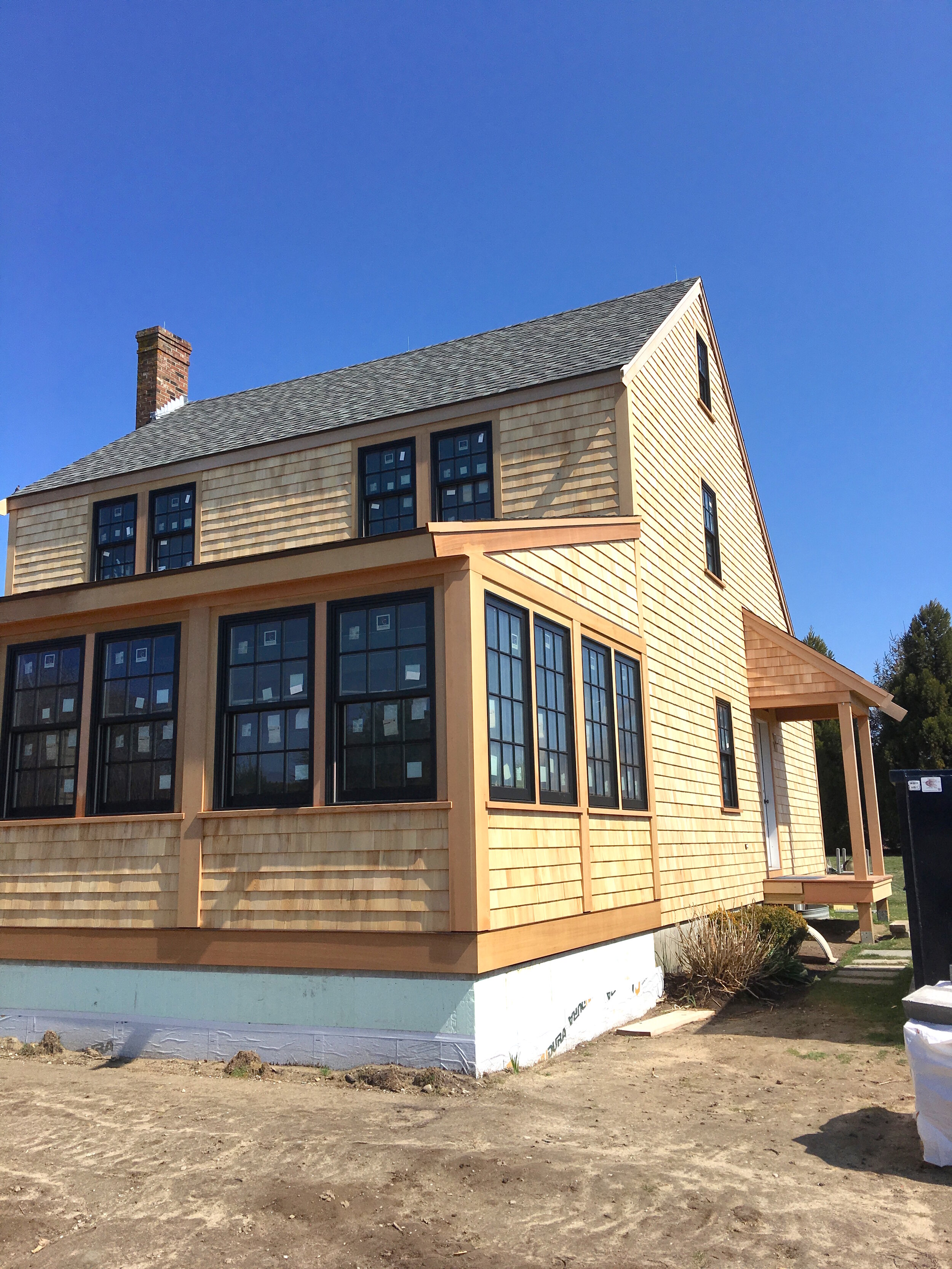
The exterior shingling brought out the contrast I wanted with our black Andersen windows, which are a prominent feature of the design Matthew MacEachern of Emeritus did for us. When the windows were first installed, they blended in with the black under-shingle paper (that is the super official name for it in case you were wondering), but once the white cedar shingles went up – the windows really popped.
Moving inside and upstairs: the flooring went in faster than I could have imagined, and before I got to see it, it was covered in protective paper. It was two months before I got to see those floors (but who’s counting?) I’m not still smarting from that or anything. Did I mention Neil got to see them, and I didn’t?
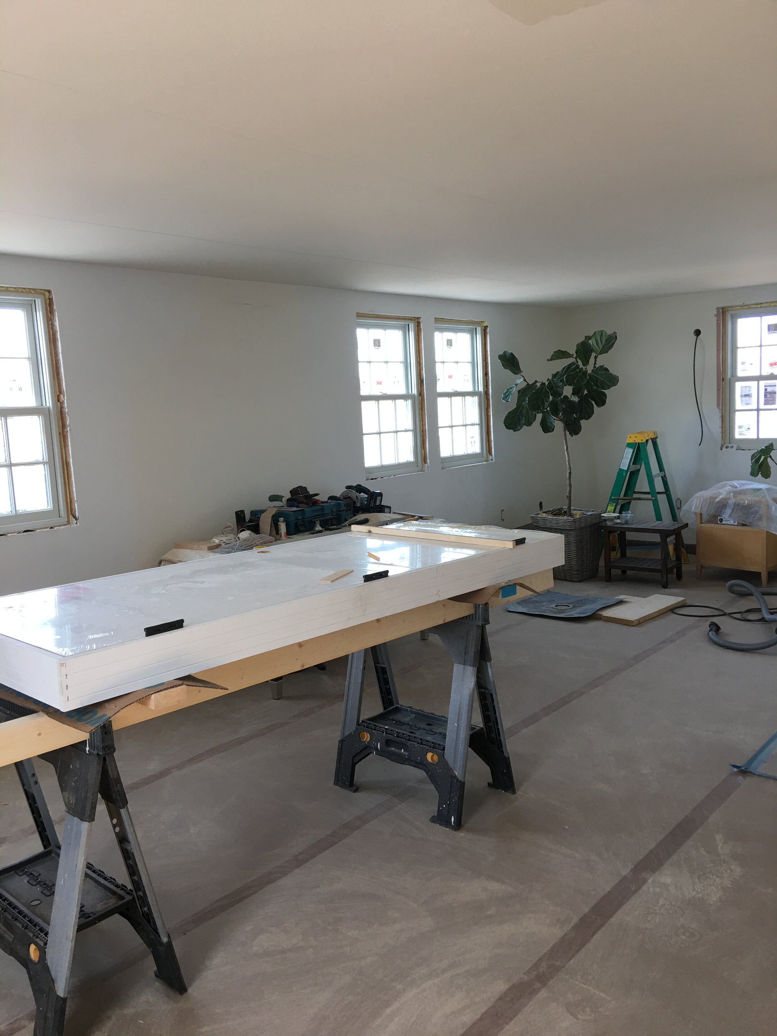
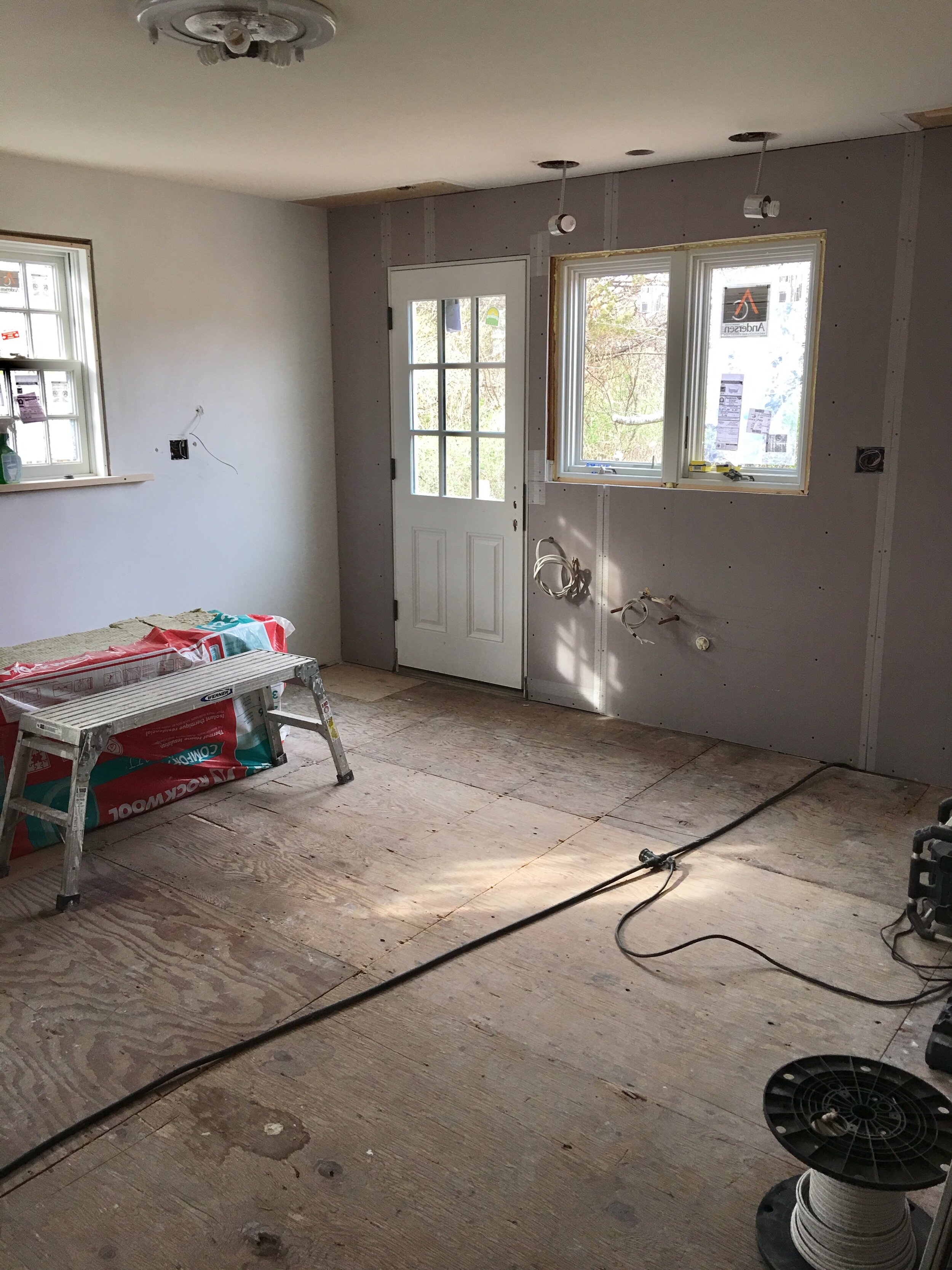
Downstairs, a lot of prep work was happening for the kitchen: electrical, plumbing, drywall, and plasterwork. I was busy picking kitchen cabinet hardware because I thought the house was going to be finished early (insert taped audience laughter), and I wanted to be prepared.
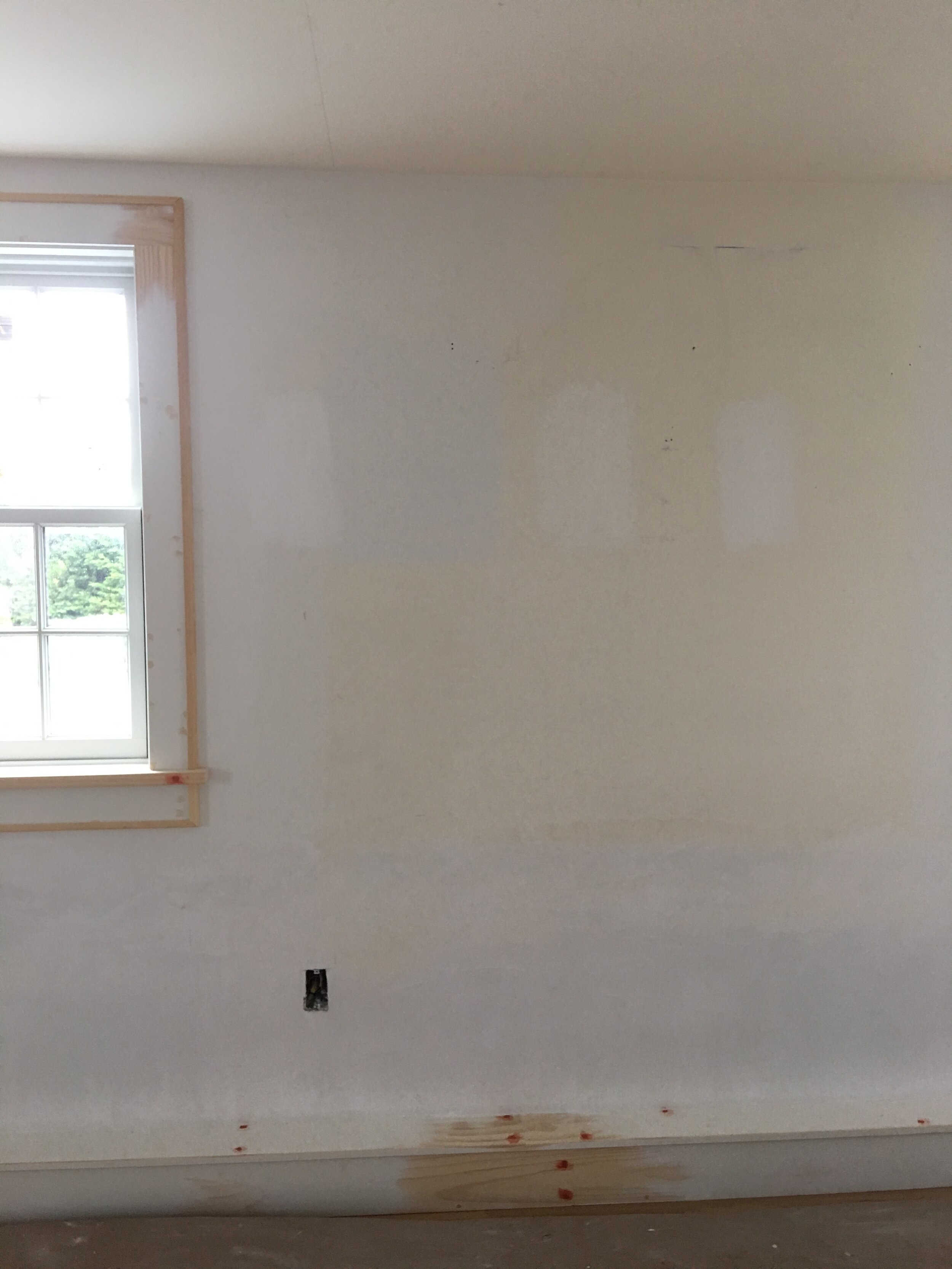
May rolled around, and it seemed like all of the work done in April was giving way to the good stuff. The interior trim went up around the windows, and it is one of my favorite details in the house. Apparently it wasn’t overly complicated to make – but it was exactly what I wanted. (Photo to follow once I reveal the paint job).
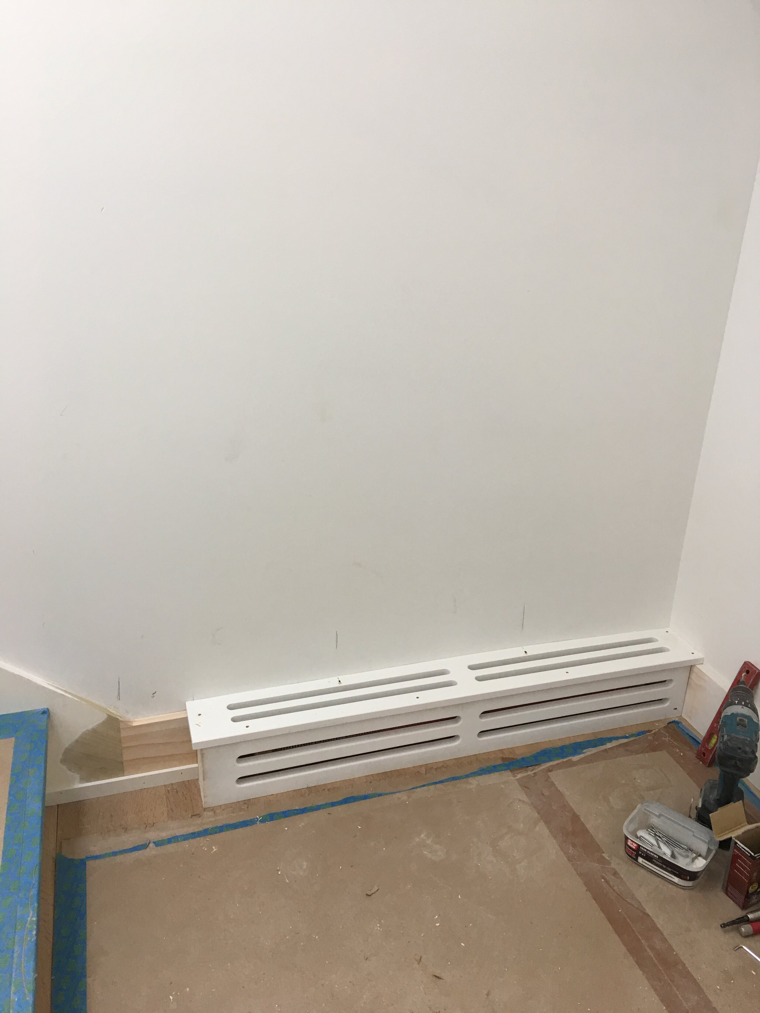
Also, our ugly, metal, baseboard heaters got a facelift. Our builder, Julius Pasys of LithCon Inc., designed and fabricated covers for them, and they look SO good. I was inundated with questions about them when I shared a photo of them on Instagram stories. I’m surprised this “design challenge” isn’t talked about more frequently. We’ve all been suffering in silence – until now!
Now comes the most controversial part of any good story: white paint. I read alllll of the white paint guides out there, including ones by All Sorts Of and Studio McGee. I figured if I could pick red wine for Neil based on the descriptions taped to the wine rack, I could pick paint that way, too.
Wrong. The blogs were supremely helpful for narrowing down my choices, but there is a reason each white paint guide ends with suggesting you try out samples in your own home.
My next step was to purchase samples from Samplize. If you haven’t heard of the company, its product is pretty cool: peel & stick, 12x12 paint samples made with real paint on one side and a repositionable adhesive backing on the other side. This allows you to stick the squares on multiple walls and in various lighting situations.
Quick aside for everyone who asked about kitchen cabinet paint colors. I’ll delve into that later. Maybe when I talk about the countertops – aka much later in this story. (I’m cracking myself up.)
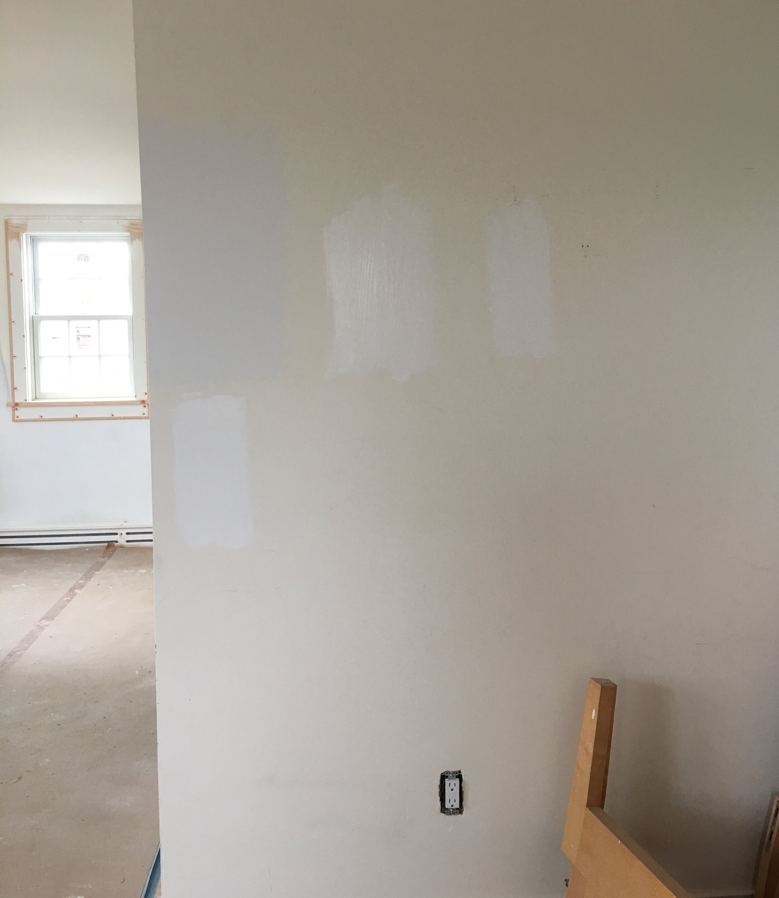
Ok, back to white paint. On some of our walls, I loved Simply White by Benjamin Moore. And on other walls, I was drawn to Super White. Then I went to a house to deliver some framed pieces, and I noticed the paint in the client’s house. The white was perfect!
The client tracked down the paint color (totally normal of me to ask him, right?) and it was Benjamin Moore White OC-151. I told our builder I had made up my mind, but he suggested I pick up a sample pot at Marine Home Center so he could paint a few patches on our walls for me to look at. This was like feeding the beast! Wouldn’t everyone around me be happier if this white paint saga ended?
All I can say is, thank goodness we sampled. I had never seen OC-151 in my house (it wasn’t one of the colors I ordered from Samplize) and for reasons I can’t explain – it read totally grey on my walls.
Chantilly Lace was on my radar thanks to all of you - I received a lot of notes on Instagram that said things like “the only white paint I ever use is Chantilly Lace.”
Finally, our builder had his painter take me to a completed house to see a few more white paint examples, which included Chantilly Lace. (My white paint deep dive was getting to everyone. I had been foisted à la Curb Your Enthusiasm.)
So, I went back to Marine and picked up more sample pots, including Chantilly Lace, Simply White and Super White.
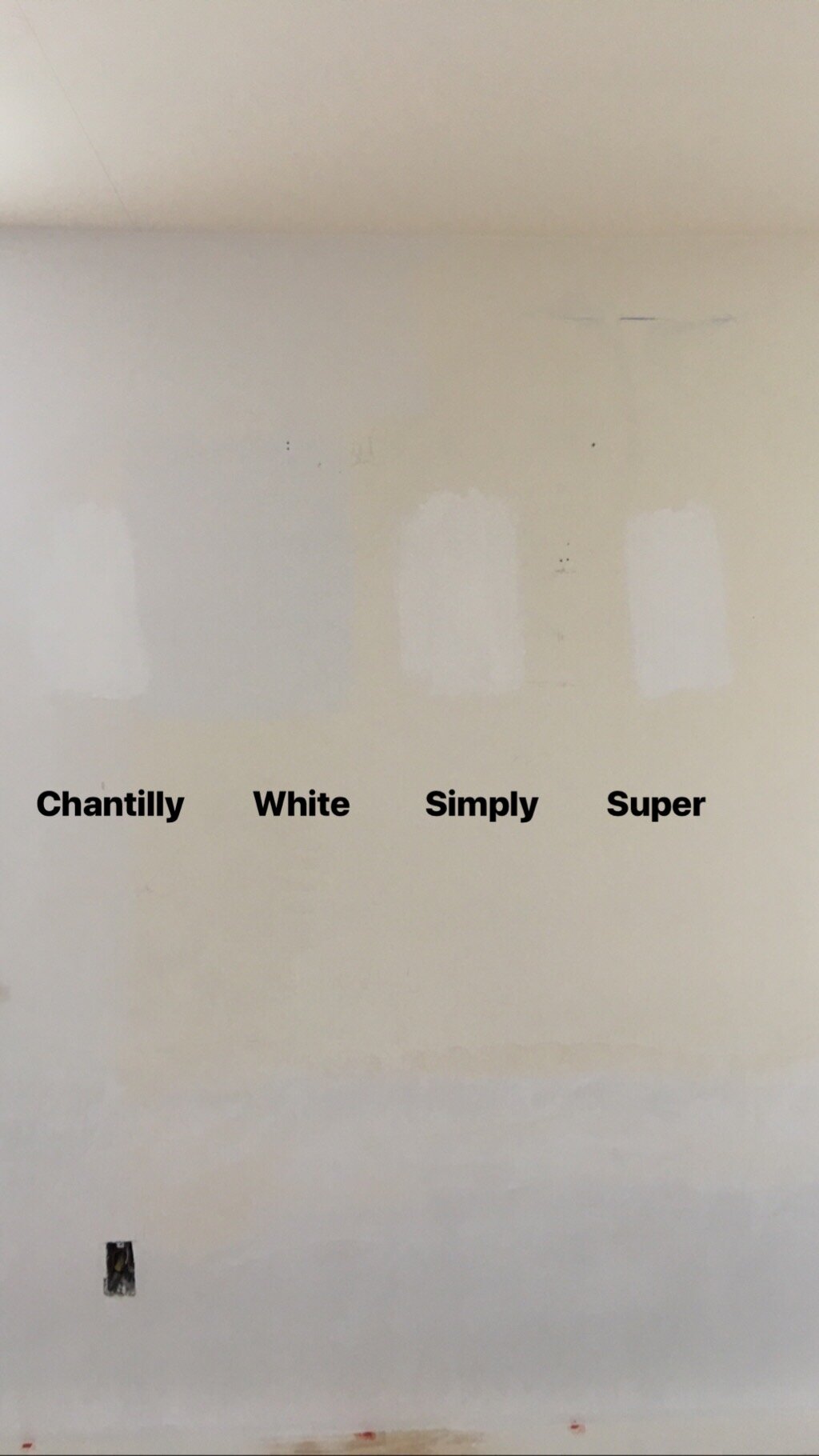
For the amount of pressure I felt to pick “the right” white paint, this feels really anticlimactic, but – drum roll, please – we went with Chantilly Lace by Benjamin Moore! And – if I had picked the white paint based on the description (like I pick red wines), I also would have picked it. “As delicate and refined as the lace it was named after, this crisp, clean white evokes images of pure silk, soft linen and simpler times.”
Next post: Kitchen cabinets, v-groove, and glass walls – oh my!